CSS-loading

  曾经以为,loading的制作需要一些比较高深的动画技术,后来发现大多数loading都可以用“障眼法”做出来。比如一个旋转的圆圈,并不都是将gif图放进去,有些就是画个静止图像,然后让它旋转就完了。gif图也可以,但是加载时间比较长。
  CSS就可以做出大多数的loading,比如:
pianoheartcirclecicrleProgress
如何制作?

loading1

1、HTML:

1
2
3
4
5
6
7
8
<div id="ddr">
<div class="ddr ddr1"></div>
<div class="ddr ddr2"></div>
<div class="ddr ddr3"></div>
<div class="ddr ddr4"></div>
<div class="ddr ddr5"></div>
</div>

2、CSS:

1
2
3
4
5
6
7
8
9
10
11
12
13
14
15
16
17
18
19
20
21
22
23
24
25
26
27
28
29
30
31
32
33
34

#ddr{
margin: 0 auto;
width: 70px;
height: 120px;
}
.ddr{
width: 10px;
height: 120px;
float: left;
margin: 2px;
background-color: #00ff00;
animation: loading 1s infinite ease-in-out;/*animation:动画名称 持续时间 动画速度曲线 延迟 执行多少次 是否正反方向轮流播放*/
}
.ddr2{
animation-delay: -0.9s;/*定义开始执行的地方,负号表示直接从第900ms开始执行*/
}
.ddr3{
animation-delay: -0.8s;
}
.ddr4{
animation-delay: -0.7s;
}
.ddr5{
animation-delay: -0.6s;
}
@keyframes loading {
0%,40%,100%{ /*定义每帧的动作*/
-webkit-transform: scaleY(0.5);
}
20%{
-webkit-transform: scaleY(1);
}
}

loading2

1、HTML

1
2
3
4

<div id="loading4">
<div id="loader4" class="heart"></div>
</div>

2、CSS

1
2
3
4
5
6
7
8
9
10
11
12
13
14
15
16
17
18
19
20
21
22
23
24
25
26
27
28
29
30
31
32
33
34
35
36
37
38
39
40
41
#loading4{
width: 100%;
height: 100px;
}
#loader4{
position: relative;
margin-left: calc(50% - 25px);
width: 50px;
height: 50px;
animation: loader-4 1s ease-in-out alternate infinite;
}
.heart:before{ // 让两个一端为圆角的长方形叠加形成心型,然后按规律缩放
position: absolute;
left: 11px;
content: "";
width: 50px;
height: 80px;
transform: rotate(45deg);
background-color: rgb(230, 6, 6);
border-radius: 50px 50px 0 0;
}
.heart:after{
position: absolute;
right: 11px;
content: "";
width: 50px;
height: 80px;
background-color: rgb(230, 6, 6);
transform: rotate(-45deg);
border-radius: 50px 50px 0 0;
}
@keyframes loader-4 {
0%{
transform: scale(0.2);
opacity: 0.5;
}
100%{
transform: scale(1);
opacity: 1;
}
}

loading3

1、HTML:

1
<div id="circle"></div>

2、CSS

1
2
3
4
5
6
7
8
9
10
11
12
13
14

#circle{
margin: 20px auto;
width: 100px;
height: 100px;
border: 5px white solid;
border-left-color: #ff5500;
border-right-color:#0c80fe;
border-radius: 100%;
animation: loading1 1s infinite linear;
}
@keyframes loading1{
from{transform: rotate(0deg)}to{transform: rotate(360deg)}
}

loading4

0、原理

![](https://raw.githubusercontent.com/wz71014q/img/master/loading-6.png) 
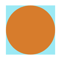
如图,先画一个正方形,这个正方形就是环形loading的轨道(现在还不是),再将一个圆放在上面,充当遮蔽物。
![](https://raw.githubusercontent.com/wz71014q/img/master/loading-7.png) 
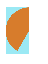
运用clip-path(原先是clip,但是这个属性即将被删除。另外clip-path属性兼容性很差)属性可以裁剪图像,将上面的圆裁为一半,假如这个圆的右半部分一直看不见,旋转左边这个半圆,会出现怎样的效果呢?
![](https://raw.githubusercontent.com/wz71014q/img/master/loading-8-1.png)
![](https://raw.githubusercontent.com/wz71014q/img/master/loading-8-2.png) 如图,就是这种效果,这时候再加一个遮罩,就形成了下面这种效果:
![](https://raw.githubusercontent.com/wz71014q/img/master/loading-9.png) 
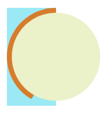
再将最下面的正方形变成圆形(变成真正的轨道),旋转橙色部分的圆环,底部青色的就会露出来,就形成了进度条的效果
![](https://raw.githubusercontent.com/wz71014q/img/master/loading-10.png) 这是左边的一半,将右边的一半补齐:
![](https://raw.githubusercontent.com/wz71014q/img/master/loading-11.png) 中间白色部分是mask遮罩,加上相应的文字,调整颜色就ok啦!
![](https://raw.githubusercontent.com/wz71014q/img/master/loading-12.png) 
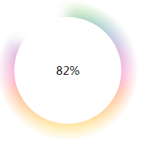
这里的渐变效果并不是径向渐变,如果用径向渐变制作,效果会更好。
1、HTML
1
2
3
4
5
6
7
8
9
10
11
12
13
14
15
16
17
18
19
20
21
22
23
24
25
26
27
28
29

<!DOCTYPE html>
<html lang="en">

<head>
<meta charset="UTF-8">
<meta name="viewport" content="width=device-width, initial-scale=1.0">
<meta http-equiv="X-UA-Compatible" content="ie=edge">
<title>Document</title>
<link rel="stylesheet" href="progress.css">
</head>

<body>
<div class="circle">
<div class="preLeft">
<div class="left"></div>
</div>
<div class="preRight">
<div class="right"></div>
</div>
</div>
<div class="mask">
<span class="progress">0</span>%
</div>
<script src="progress.js"></script>
</body>

</html>

2、CSS

1
2
3
4
5
6
7
8
9
10
11
12
13
14
15
16
17
18
19
20
21
22
23
24
25
26
27
28
29
30
31
32
33
34
35
36
37
38
39
40
41
42
43
44
45
46
47
48
49
50
51
52
53
54
55
56
57
58
59
60
61
62
63
64
65
66
*{
margin: 0;
padding: 0;
}
.circle {
width: 200px;
height: 200px;
border-radius: 50%;
box-shadow: 0 0 7px 0px inset;
background:linear-gradient(#9ED110, #50B517, #179067, #476EAF, #9f49ac, #CC42A2, #FF3BA7, #FF5800, #FF8100, #FEAC00, #FFCC00, #EDE604);
filter: blur(8px);
transform: scale(1.1);
-webkit-mask: radial-gradient(black 30px, #0000 90px);
}
.preLeft{
position: absolute;
top: 0;
left: 0;
width: 200px;
height: 200px;
clip-path: polygon(0 0, 50% 0, 50% 100%, 0 100%);
}
.left{
position: absolute;
top: 0;
left: 0;
width: 200px;
height: 200px;
border-radius: 50%;
box-shadow: 0 0 3px 0px inset;
background: #fff;
transform: rotate(0deg);
clip-path: polygon(0 0, 50% 0, 50% 100%, 0 100%);
}
.preRight{
position: absolute;
top: 0;
left: 0;
width: 200px;
height: 200px;
clip-path: polygon(50% 0, 100% 0, 100% 100%, 50% 100%);
}
.right {
position: absolute;
top: 0;
left: 0;
width: 200px;
height: 200px;
border-radius: 50%;
box-shadow: 0 0 3px 0px inset;
background:#fff;
transform: rotate(0deg);
clip-path: polygon(50% 0, 100% 0, 100% 100%, 50% 100%);
}
.mask {
width: 150px;
height: 150px;
position: absolute;
left: 25px;
top: 25px;
border-radius: 50%;
/* box-shadow: 0 0 5px 0px; */
background: #FFF;
text-align: center;
line-height: 150px;
}

3、JS更新内部进度

1
2
3
4
5
6
7
8
9
10
11
12
13
14
15
16
17
18
19
20
21
function init() {
let left = document.getElementsByClassName('left')[0];
let right = document.getElementsByClassName('right')[0];
let progress = document.getElementsByClassName('progress')[0];
let value = 0;
let timer = setInterval(() => {
if (progress.innerHTML < 100) {
progress.innerHTML = value++;
if (value <= 50) {
right.style.transform = 'rotate(' + (value * 3.6) + 'deg)';
} else if (value <= 100) {
left.style.transform = 'rotate(' + ((value - 50) * 3.6) + 'deg)';
}
} else {
clearInterval(timer);
}
}, 100);
}
window.onload = function () {
init();
};

逢年过节,百度或者谷歌都会在首页播放一段动画,比如元宵节:

![](https://raw.githubusercontent.com/wz71014q/img/master/loading-13.gif)
这个动画不仅仅是gif图,有时候是一张长长的包含所有帧的图片: ![](https://raw.githubusercontent.com/wz71014q/img/master/loading-14.png) 仿照animation一帧一桢的思路,可以将这张图片做成动画:
1
2
3
4
5
6
7
8
9
10
11
12
13
#picHolder{
/* 图片样式 */
position: absolute;
top: 17%;
left: 50%;
width: 270px;
height: 129px;
margin-left:-135px;
background-image: url("../../../Library_image/tangyuan.png");
background-repeat: no-repeat;
background-position-x: 0;
cursor: pointer;
}
1
2
3
4
5
6
7
8
9
10
11
12
13
14
15
16
17
18
function animation () {
/* 定时移动图片,使观众看到不同的帧 */
var po = 0
var i = 0
var holder = document.getElementById('picHolder')
setInterval(function () {
po += -270
i++
holder.style.backgroundPositionX = po + 'px'
if (i >= 31) {
i = 0
po = 270
}
}, 100)
}
window.onload = function () {
animation()
}